In my previous article UnMasking Inflation, I pointed out that rising consumer prices, as measured by the Consumer Price Index (CPI), are a misleading measure of inflation.
There are two reasons for this. First, the CPI only measures “consumer” items like food, clothing, fuel, and shelter, and it doesn’t even attempt to calculate some essential expenses.
For example, since 2010, the cost of saving has more than tripled under the Fed’s Quantitative Easing policies. Accumulating a nest egg for future consumption is not included in the CPI., but to anyone living above a bare subsistence level, regular provision for the future is as important as consumption today.
The second reason CPI fails to measure inflation is CPI often understates real price increases, creating a false picture of trends in the cost of living. A leading example is the index’s estimate of “shelter” cost, representing the cost of owning or renting a home.
Look at the upward spike on the right side of the graph. The median price of a new home rose to an all-time high of $408,000 at the end of September, up from $322,000 one year ago. That’s a year-to-year increase of about 21%.

Of course, a home is almost always financed with a long-term mortgage, which is paid monthly. So we should analyze the monthly costs of homeownership before and after the recent increase in home prices.
Using Zillow.com’s handy mortgage calculator, we constructed the table below. Monthly payments include charges for principal, interest, taxes, and insurance. The combination of higher home prices and slightly higher mortgage rates raise homeownership’s monthly cost by over 22%.

If you are looking to become one of the country’s 80 million homeowners, or if you want to sell your house to buy a new one, you may soon discover that the monthly cost of owning a home has gone up enough to put it beyond your financial reach.
A 20-plus percentage point rise in the cost of homeownership is certainly not reflected in the Consumer Price Index (CPI). According to the Bureau of Labor Statistics (BLS), October CPI increased 6.2% from October 2020, the highest annual rise in 31 years.

The CPI contains broad cost categories like food (14% of the index), energy (7.3%), and household commodities (20.7%). The largest category within the CPI is the aforementioned “shelter” component, comprising 32.6% of the overall index.
But the cost of paying for a house – the most significant cost borne by most homeowners – is not even considered when calculating the CPI.
For example, the BLS estimates the annual increase in shelter costs over the last year was only 3.5%. This rise contributed only about 1% to the 6.2% increase in the overall cost of living. (The calculation is: 32.6% x 3.5% = 1.1%)
That’s a far cry from a 22% increase in the monthly cost to own a home. How to explain this vast difference?
The answer lies in how the BLS calculates the “cost of shelter.” The BLS estimate does not attempt to estimate the cost of paying off a mortgage, nor does it fully reflect the increase in rental rates. Instead, the Bureau uses a simple estimating technique that unusually understates shelter costs.
Most of the CPI cost-of-shelter comes from a line item called “Owners’ Equivalent Rent” (OER) derived from a subjective telephone survey. Every month, BLS government employees call up thousands of homeowners and ask them to guess how much they think a renter might pay for their home.
Yes, that’s right, they ask people to guess. Most homeowners have no clear idea how much their homes would rent for because most have no reason to know.
Additionally, the published monthly OER is an average of the last six month’s surveys, which means this month’s survey counts as only one-sixth of the published estimate. In a rising housing market, this technique ensures outdated numbers dominate, understating the current trend.
The remainder of the “shelter” category is called “rent of primary residence,” derived from surveys of those who rent their homes. According to the BLS, the recent annual increase in rents was 2.7%
But non-government data all say that number is too low. For example, according to Apartmentguide.com, rents on new leases are up over the same period by 18 to 19%.
Consider that rented homes turn over every three to five years, so today’s 19% increase in apartment rent only affects 20 to 30% of all apartments. However, as leases expire and the new higher prices are applied, the rest of the nation’s rental inventory will increase in price.
So it’s clear that even though the CPI increase is the highest in decades, it nonetheless understates the increase in the cost of living. The lag built into the index’s dominant “shelter” component assures that higher CPI numbers will persist for many more months.
For example, if we assume an overall increase of 20% in the cost of “lodging” (owners’ equivalent rent plus rent of primary household), this alone raises the CPI by 6.5% (20% x 32.6% = 6.5%). Now add a 5% increase due to the other (non-lodging) items, and we could be looking at annual CPI inflation of over 11%. This calculation is not a prediction but a realistic analysis of what “persistent” inflation could look like.
Most of today’s talking heads are too young to recall the persistent inflation that ravaged the US economy in the 1970s. One such neophyte is an MSNBC reporter who recently suggested these high CPI numbers were not a big deal because “on average we can afford it.”
Her comment reminded me of President Jimmy Carter’s attitude back then, captured in a hilarious SNL parody.
Inflation is our friend!
Wouldn't you like to own a $4,000 suit, and smoke a $75 cigar, drive a $600,000 car?
I know I would!
Everybody will be a millionaire! pic.twitter.com/rkFObjt9lA
— Phil Kerpen (@kerpen) November 15, 2021
Only a few months ago, the Fed claimed there was “no inflation.” Later it hedged this statement, moving from “no inflation” to “transitory inflation.” Recently the Fed has swung again, from “transitory” to “transitory for an extended period” – which is starting to sound a lot like “persistent” inflation. This is classic “Fedspeak,” designed to provide cover for previous mistakes.
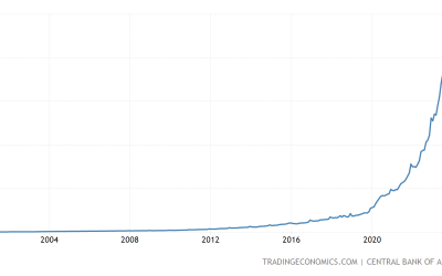
After three decades of relatively benign consumer price increases, what could have caused this unpredicted acceleration of nearly all prices?
I’ll discuss that in detail in a later post. For today, I’ll leave a clue in the form of the graph below, which shows the exploding US money supply. Almost 30% of all the money ever created in the US came into existence in the last 22 months.

As regular readers know, all this new money – a product of pure credit creation – originated in the banks.